This project was about more than design. It was about creating a full, lived experience that reflects the school’s identity in every corner, hallway, and interaction.
We started by understanding the essence of the school — its values, visual identity, and how students, teachers, and families move through the space. From there, we designed a system that brings those values to life through space, color, material, and flow.
Uniform and Identity Design
Custom sports uniforms were designed to reflect the school’s colors, values, and active culture. The patterns and colors match the energy of the space they are not just functional, but expressive. This turns sports into a visual and emotional extension of school culture.
Sports and Movement Spaces
We didn’t treat sports areas as separate, they’re part of the identity.
The swimming pool, indoor gym, and outdoor courts were designed with clean,
functional layouts and materials that support movement, safety, and school pride.
Graphics and colors from the school identity system are integrated into every
surface. Even the locker room signage speaks the same language.
Branding Through Space
The visual identity of the school was extended beyond the logo. It shaped the wayfinding,
signage, and the tone of each space.
From the front gate to the back corridor, the school now speaks one clear visual language.
Every vinyl mural was digitally illustrated and tailored to its location,
playful where students gather, calm where they focus, bold where movement happens.
Interior Design and Space Planning
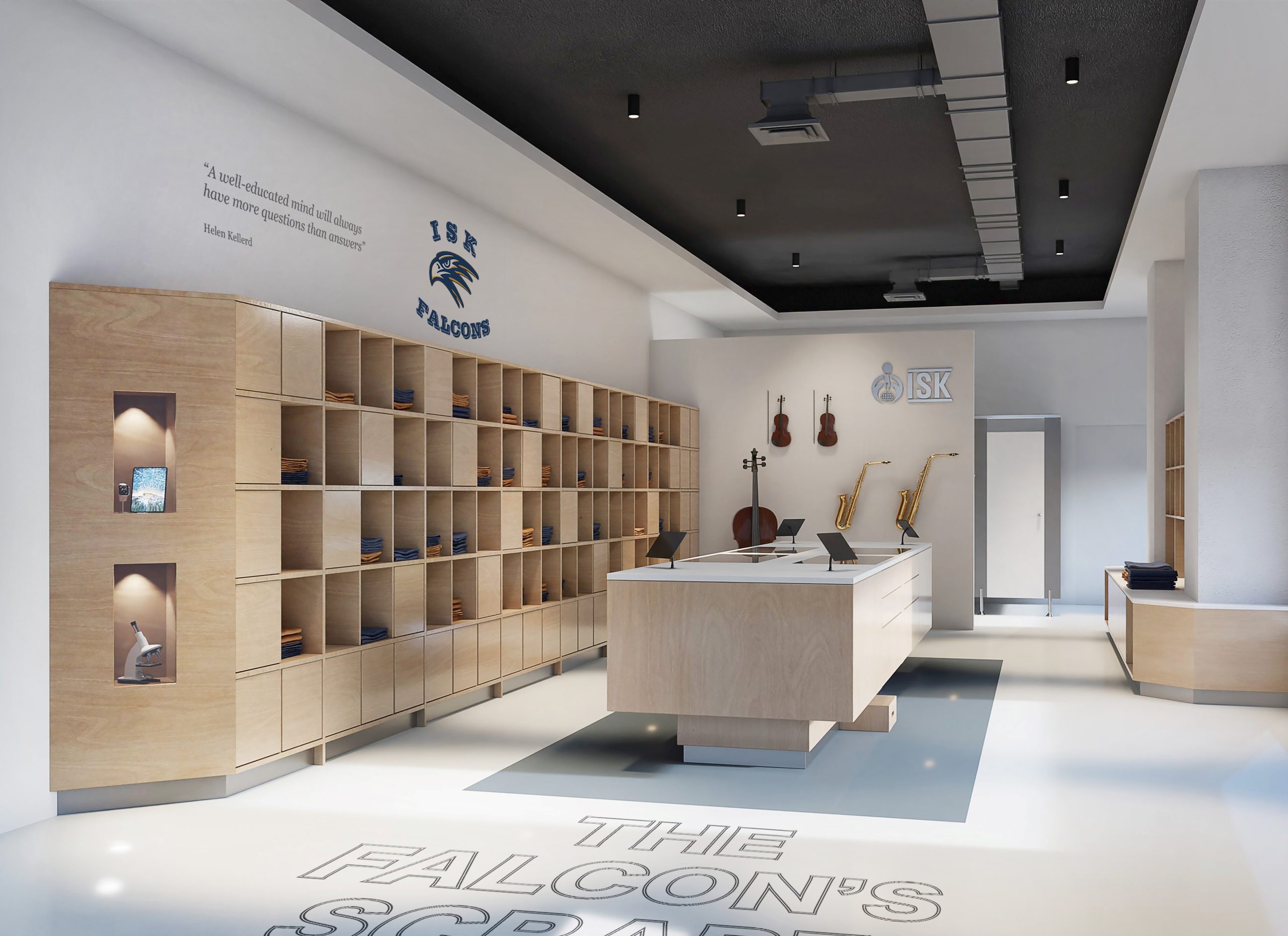
We redesigned key areas including the concept store, library, locker zones,
classrooms, and corridors. The concept store was more than a retail space.
It became a flexible experience , part uniform shop, part instrument corner,
part school gallery. It was planned to feel like a natural extension of student
life, not just a place to shop.
The locker and hallway areas were planned for real flow. We considered
how students walk, gather, wait, and talk. Every turn and surface was intentional.
No dead corners, no wasted walls. The library was redesigned to be a warm and
focused place, with soft textures, natural light, and zones for different